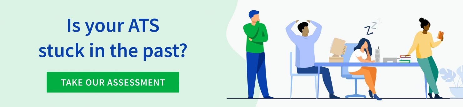
Usability is an often overlooked feature in HR systems. Systems built more than 20 years ago were born from a mindset that having the technology to manage recruitment activities was better than working on paper, and it was—if you could learn how to navigate complex hierarchies and onerous drop-down lists.
Over the last decades, the practice of user experience (UX) design has transformed systems used by consumers, frontline workers, and even government employees. Even though everyone benefits when systems are easy to use, HR and talent acquisition in particular have not always benefited from the trend toward greater usability.
According to Aptitude Research, only 40% of recruiters would recommend their current recruitment technology. In fact, the same study revealed that 50% of recruiters would join another organization if it had better technology.
At SmartRecruiters, we don’t believe a recruiter should want to leave their job because they’re tired of using outdated technology. One of the most common comments we hear in product demonstrations is, “it looks so easy to use.” After leading the implementation of SmartRecruiters at Deloitte Netherlands, a 7,000-employee-strong organization, Eric Houwen, Head of Talent Acquisition said, “People just intuitively knew how to use SmartRecruiters.”
What goes into building an intuitive, easy-to-use applicant tracking system? Shefali Netke, SmartRecruiters Global Director, Design holds the answer. Since 2016, she’s been partnering with both the product and engineering teams to deliver a usable and dare we say, lovable hiring platform.
Here are some of the considerations she and her team take into account in their daily work.
Design considerations
Easy to use and lovable
When designing a new feature or workflow, Shefali said, “Our baseline is usable, from there we always look to ensure it is as easy and intuitive as possible. And finally, we look at how to make it lovable–an overall great experience.”
Her team has weekly design critiques where they look closely at pages and how they work together. “We make sure to consider what we can take away from the page to make it less overwhelming and reduce the cognitive load so that users can take actions faster,” she said. That might mean reducing the number of clicks or adding bulk actions so that users don’t have to repeat tasks.
User research is an important aspect of making the system easy to use and lovable. SmartRecruiters customers can participate in the Design Lab, a collaborative space where customers engage in creative sessions and usability testing for our products. “We spend a lot of time putting ourselves into the customer’s seat,” Shefali said.
Worldwide
Many SmartRecruiters customers recruit in multiple countries in multiple languages. The product is currently available in 34 languages. Task and heading names are modified from direct translations to account for local terminology. Additionally, the design team takes into account the fact that some languages have more characters in each word than others. An English-centric design might truncate words in the wrong places, making the views difficult to understand for a user in another language (such as German) with longer words.
Accessible
Growing awareness of the needs of those with motor impairments, cognitive limitations, or visual disabilities has spurred a revolution in accessible design. When designing and developing our products, we consider W3C standards, and aim to be compliant with the Web Content Accessibility Guidelines (WCAG 2.1) Level AA. Periodically, the team runs accessibility audits and builds accessibility product enhancements into the product roadmap.
Pay attention to workflow + architecture
Building a functional product entails a lot more than designing a good interface. All the pieces have to work together on the backend so that the hiring workflow is not interrupted. Cross-functional collaboration among designers, product managers, and engineers makes this possible. “We put a lot of thought into a holistic view of the product and dependencies,” Shefali said. “Everything has to scale so that every action or decision helps people hire smarter and faster.”
Personas
An ATS has several types of people using the system. The most common roles are recruiter, recruiting coordinator, executive, hiring manager, interviewer, and candidate. Usability is equally important for each one. Let’s take a look at the top three: recruiter, hiring manager, and candidate.
Recruiter usability
Since recruiters conduct much of their work in the ATS, careful consideration is given to how they flow between tasks and what they can view on each screen. In the image below, a recruiter can see all the open jobs and filter them by department, location, status, hiring manager, and more. Additionally, they can click on a button with a number and a drop-down and be taken to the applicant list for that group.
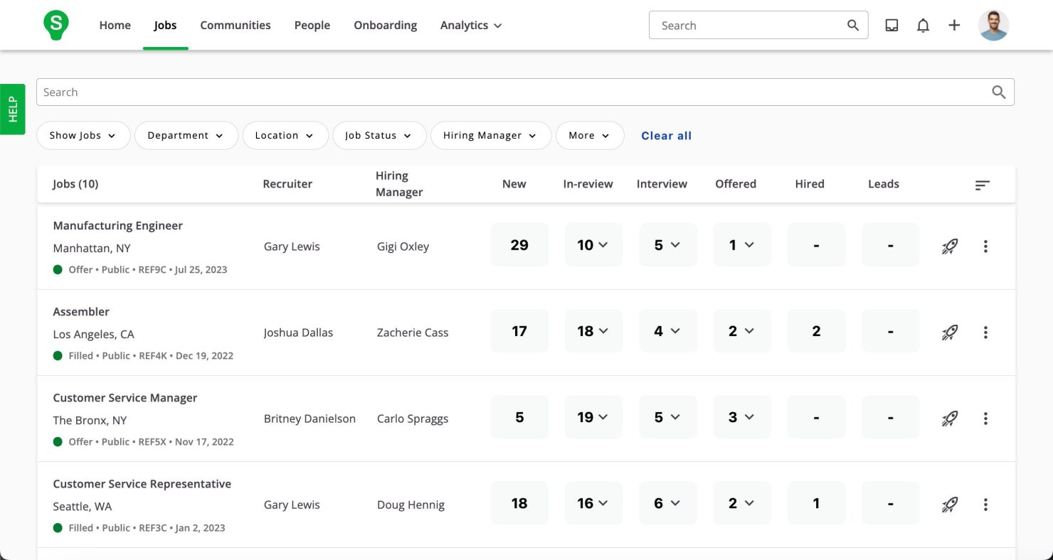
In the applicant list shown below, the recruiter sees key facts about each applicant and can further filter the view based on rating, match score (if using SmartAssistant), screening questions, location, and more.
Hiring manager usability
Since hiring managers don’t use an ATS all day, it’s important that it be easy enough to use so that they keep coming back. “People engage faster if we reduce complexity when they first come in,” Shefali said. System adoption by hiring managers ensures better data collection, which in turn helps provide actionable metrics to improve processes.
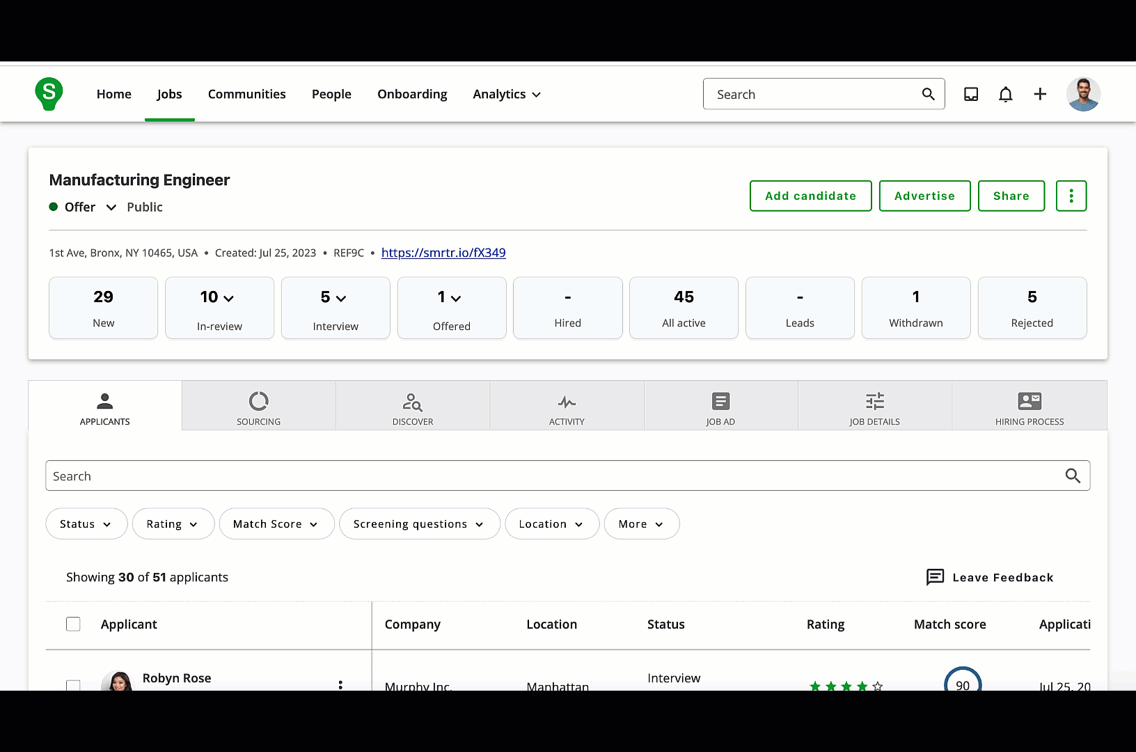
In addition to ensuring usability, the design team seeks to ensure that the system enables transparency among hiring teams so they can have those meaningful conversations that facilitate quality hires. When hiring managers log in, they can immediately see all the communication related to a position, link to the candidate profiles, scorecards, and assessment results. “It shifts the conversation by taking the logistics out of collaboration, because everyone’s in one space,” she said.
In the following view, the hiring manager can view all the recent activity on open jobs and upcoming interviews.
It was really important that our new system would be easy to use for hiring managers in all our stores across many countries. We rolled out SmartRecruiters with a simple mobile training and optional webinars.
– Karolína Kroužková, HR Digital Manager JYSK
Candidate usability
The application process is the most visible part of candidate usability, and SmartRecruiters’ one-click flow has delighted many applicants. Interview self-scheduling is another benefit to candidates. But there’s more to a candidate’s experience than just what they see on screens.
“By making the technology more usable for hiring teams, candidates have a better experience overall,” Shefali said. “If recruiters can screen more accurately, respond faster, and hiring teams have tighter feedback loops, the candidate gets closure faster.”
Applicant tracking system usability helps net better hires
When everyone is working together in the same system for a common goal–making great hires–it’s easier to get positive results that impact the business. Christine Marriott, a SmartRecruiters customer at Catholic Healthcare said,
The transparency in SmartRecruiters has been gold for us. It helped us work more closely as a team because anyone can step in and know exactly what’s happening.
For Catholic Healthcare, more collaborative hiring processes enabled the team to improve retention rates for new hires by 30% and improve job board employer ratings. What’s not to love about that?
To get started on your journey to greater usability for your hiring teams sign up for a demo today.